Lisette Geurtsen
NETHERLANDS
Brand Identity, Brand Guidelines, Visual System
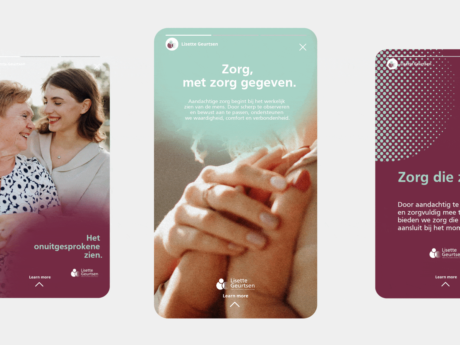
Translated Lisette Geurtsen’s observation-first dementia care approach into a calm, sensory-led brand identity that feels reassuring, human, and emotionally safe rather than clinical.

2026
COBJÉ Agency
Role:
Brand Designer & Art Director
The creative direction is based on soft orientation, guiding gently rather than instructing, with circular forms, a dementia-friendly color palette, and imagery of quiet moments and natural light to evoke safety and familiarity.
In collaboration with proffesional creative partners and social media manager.
Sketch & Moodboard


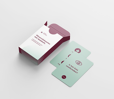
An observation card
I created this card as a practical tool to support nonverbal understanding, helping caregivers connect through noticing rather than directing. The result is a cohesive brand system that supports emotional safety, trust, and meaningful connection across all touchpoints.

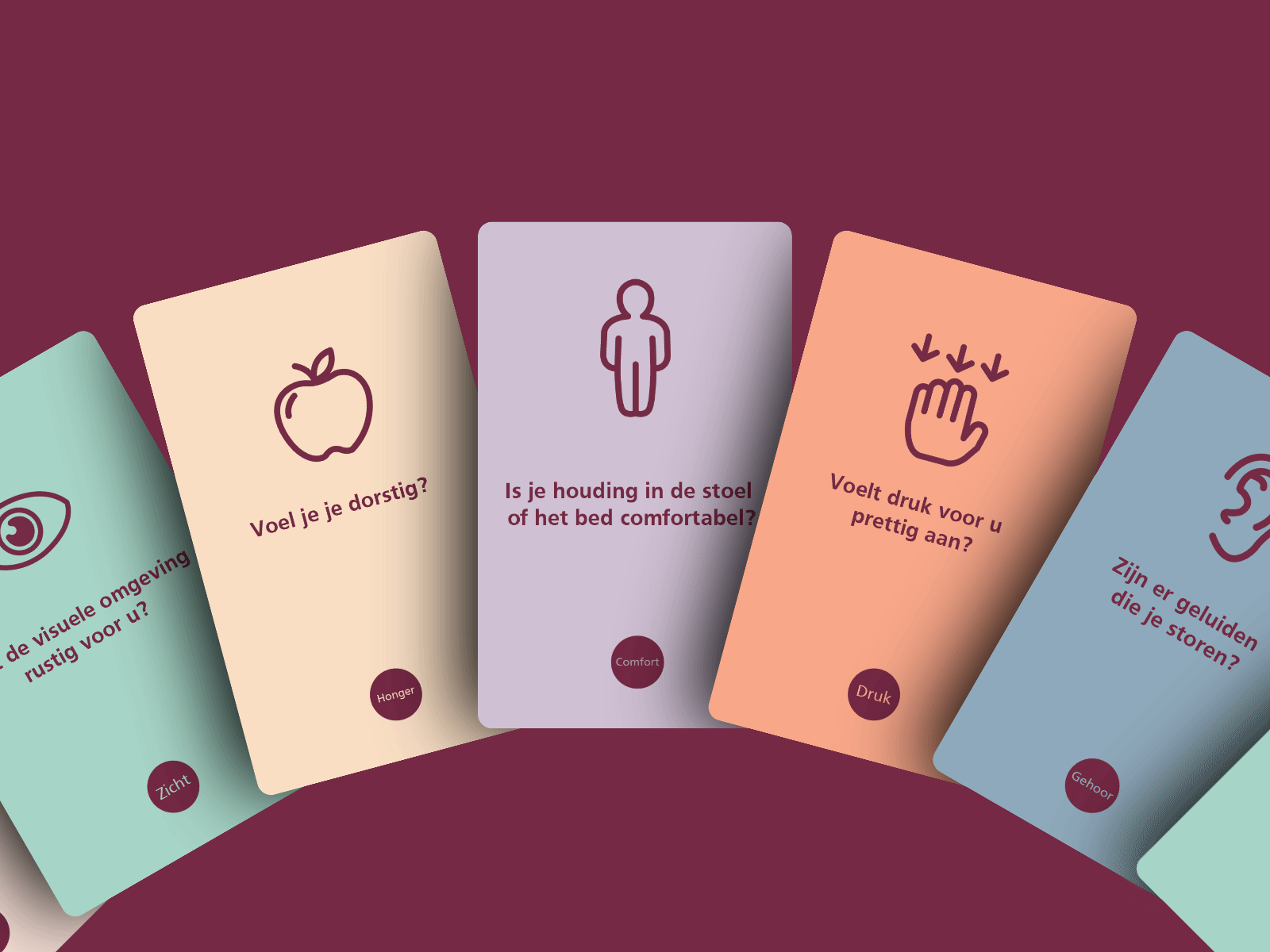


The creative direction is based on soft orientation, guiding gently rather than instructing, with circular forms, a dementia-friendly color palette, and imagery of quiet moments and natural light to evoke safety and familiarity.


"When I started developing my dementia care initiative, I needed a strong and meaningful visual identity. They translated my vision into a thoughtful brand identity and digital presence that reflects both professionalism and empathy. The process was smooth, collaborative, and very inspiring."
Lisette Geurtsen
SI Therapeut en expert